The Bar at 327 Braun Court
The Problem
The previous website for The Bar at 327 Braun Ct failed to showcase the local eatery's character or support its business goals. Content was presented without structure, making the experience confusing and hard to navigate. The online menu lacked visuals and descriptions, while low contrast between text and background hurt readability. There was no clear flow for online ordering, and the absence of brand storytelling left visitors without a sense of the bar’s identity or community roots.

Design Decisions
Provide an intuitive, informative shopping experience.
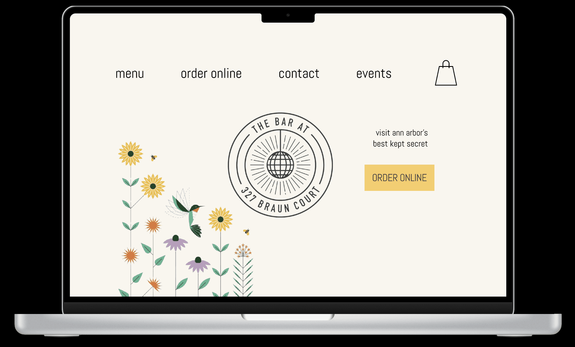
Keep aesthetic consistent with bar’s simplistic logo and menu cover art.
Support clear online ordering flow.
Improve visibility + readability of content.


Process
I began with low-fidelity wireframes to focus on layout and information hierarchy without being distracted by colors or visuals. These early designs helped me map out the main flows for browsing the menu and checking out. Feedback from peers guided refinements, such as underlining clickable item names and using progress indicators in the checkout flow. Finally, I developed high-fidelity mockups that aligned with the bar’s branding and applied visual principles like the von Restorff effect to draw attention to key actions.

Outcome
The redesign improved usability by adding structured menu content, detailed product pages, and a clear three-step checkout flow. Applying the von Restorff effect highlighted key actions like “Add to Bag,” making the site more intuitive.
Through this project, I learned the importance of content hierarchy and subtle design details in shaping user confidence. Next steps would include usability testing to refine the experience across desktop and mobile.